
The article discusses why a Mobile Optimized Website is important for businesses. Websites are a great medium to reach your customers. For small and medium-sized businesses, it is important to have a website. And these websites should be optimized for desktops as well as for mobile phones. Today, more and more customers and website visitors are dependent on mobile phones to browse websites and services offered by businesses of all sizes. Dependencies of people on mobile phones have increased to the point that it has become imperative to take care of their experience when they are on your site.
Smartphones and mobile devices have generally gained popularity. People use them for accessing the internet like never before. From shopping online to using Google to find answers to their day to day queries, to hanging out on popular social media sites, smartphones have become a convenient gateway to access the internet. Therefore, it is more than necessary to have your business website optimized for mobile devices today. It is no longer just another thing you can do with your website, but an absolute necessity.
This is the major reason why many small and medium businesses have already optimized their websites for mobiles and smartphones. Because without mobile optimization the websites on mobiles will open exactly as they are intended to open on desktops. And with small screen size, the results will be disastrous.
So we can safely conclude that mobile sites will continue to gain in prominence as time goes by. If your site is still not mobile optimized, then it is time you review how it could be impacting your business online. Smartphones are the place where your customers are, so it must be the place where you also should be.
If you still need reasons and solid facts to make it clear, then here are the 10 best reasons to make a mobile-optimized website for small and medium businesses.
1. Everyone is on Mobile
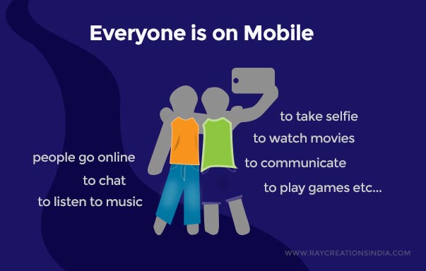
We live in a world where smartphones have quickly gained popularity and expanded into every household and every type of economy. People need phones to communicate, go online, chat, listen to music, watch movies, and play games. I haven’t exhausted the list, I am sure many people put their smartphones to many other uses. It is an indispensable tool. Everyone has become dependent on smartphones and the dependency will only rise over the years.
When we talk about numbers and facts, we can conclude that over 1.2 billion people access the web from smartphones or mobile devices. This is a number of approximately 80% of all internet users. It would not be wrong to say that the majority are going online using their smartphones.
This is the number one reason to opt for a mobile-optimized website for your business.
2. Users Behave Differently On Mobile
We can consider hypothetically that there is the same set of people behind both mobile and desktop. But they behave very differently when on different devices.
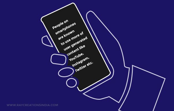
Smartphones with lesser processing power and bandwidth ought to be more text-oriented sites being viewed on them. But interestingly it’s the other way around. People on smartphones are known to use more user-generated content like YouTube, Instagram, Twitter, etc.
These social media channels have achieved huge success by offering short videos and a lot of imagery. These short videos and images are key to capturing the mobile user’s attention.
Capturing this traffic would necessitate having a mobile-friendly website with a very well-optimized design. This should help engage the mobile users craving for videos and images, and for user-generated content. Let your content be easily accessible and shareable at the same time. Use social media icons in order to facilitate sharing your products & services with their friends and community. When people share your content becomes more credible to their friends and community and capture more eyeballs and in turn sales.
This is why business these days are using mobile optimized websites as it helps share your visual media and also help generate more shares.
3. Users Switch Between Devices
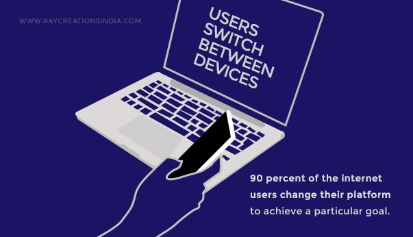
Surveys have proven that more than 90 percent of the internet users change their platform or device in order to achieve a particular goal. This simply means that even after having most of your website conversions from desktop users can also engage with your website from a smartphone at any point in your sale process. This is simply because most of the people get bored while looking at the websites so they use phones to look at things that they find interesting. And when they get interested they switch to a desktop for completing the purchasing process of the product that they have probably found on smartphones.
Hence, if your website is not capable of responding to multi-screen sizes then you may lose most of your sales.
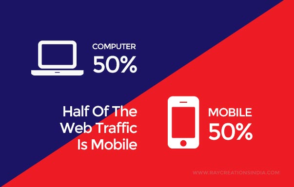
4. Half Of The Web Traffic Is Mobile
Every website owner is looking at increasing its sales and traffic. As we all know that mobile users have increased many folds over the years, and it continues to increase every day.
There is an indication that over half of the web traffic is accessed via mobile phones. This can be a solid reason why you need to have your website optimized for mobile phones as most of your customers use mobile phones for accessing the internet.
5. Mobile Users Buy More
Mobile users buy more services when compared to desktop users. A smartphone user can be accounted for the lowest dollar per transaction. For the small and frequent purchases, these mobile users are ideal. Like if you have something to sell below $10 or 15 then they can be the best audience for your services and products. Many of the mobile phone users who visit your websites can be interested in your product and services and can opt to buy those services. But for sales to happen, your mobile website should be responsive enough to handle that processing.
Poorly designed websites that are not mobile optimized would probably lose out on all those sales, as their interface is built to handle transactions for smaller screens.
6. Lets You Get More Social

Use your website to build a huge social following. The mobile can help here as 91% of mobile use is for social use. The mobile is primarily used as a source for going online to their preferred social platforms and engaging in social activities. The advantage of having a mobile-optimized website is that you can tap into this potential source of unlimited traffic and users, and convert them into loyal customers and followers.
For that, the users should be able to seamlessly follow from the social media to your site and vice versa. And that can only happen when your site is mobile optimized and can be accessed with ease on all platforms.
7. Different Strategies For Mobile Landing Pages
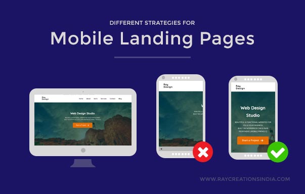
For any website, the landing pages are the main player in the conversion process. And how these landing pages convert can impact hugely on the revenue generated by your website.
But the landing pages are way different in cases of desktop and mobile websites. Some of the basic things remain the same on both the platforms, but mobile screens are not able to handle all kinds of bandwidth-intensive visual representation that is employed on desktop screens.
If your business demands more purchases and sales then you will need to create responsive landing pages suitable for mobile phone users.
8. Great Mobile Sites Help Differentiate Your Brand
Having a website specifically optimized for mobile phones is the greatest way to separate yourself from the competition. As of now, many of the business websites are not optimized for smartphones. And about 54% of the business websites are not responsive.
Most of your competitors would have un-optimized mobile sites and this could turn out to be beneficial for you. You could tap the market where they are lagging behind.
Optimizing your website for mobile devices is the best and easy way to gain an edge over your competition.
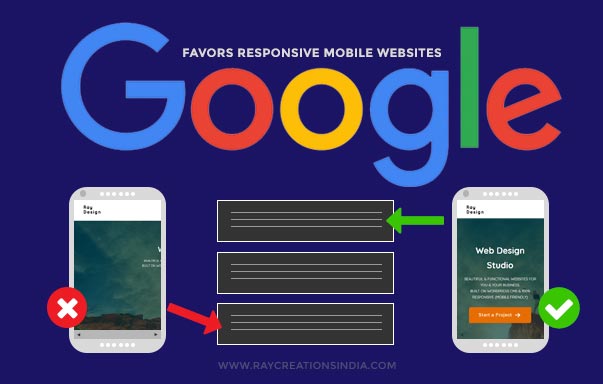
9. Google Favors Responsive Mobile Websites
Everyone knows the importance of search engines like Google for their business websites. These search engines are lifelines for tons of websites, as they provide them with huge organic traffic. This organic traffic in the long term is better than any kind of paid traffic, in terms of visibility and conversion. It, therefore, saves you a huge amount of dollars that otherwise, you would be paying to these search engine giants.
A perfectly mobile-optimized website has an advantage over the non-Responsive website. Google does favor sites that make the internet a better place. And a perfectly mobile-optimized site does just that. A when we say favor, it means a slight edge in organic traffic for your optimized site.
Google keeps updating its major algorithms and enables penalties for websites that fail to meet its standards or violates them. And one of the recent updates in Google algorithm is about the growing importance of mobile responsiveness.
Google wants to ensure that the web is friendlier for mobile users. Therefore, the update ensures that perfectly optimized sites would be ranked even higher than before. And a site that does not fit that bill, would be ranked lower than before.
Hence, if you are serious about gaining more organic traffic then you must ensure that your site is mobile optimized.
10. Advertise Your Website On Mobiles
As we have already seen that smartphones offer a great way to building a brand value that differentiates your business from your competition. But have you considered that mobiles can be a great medium to advertise your business online?
People are already spending around 23 days a year on mobiles, and this is only going to increase over time. The dependence that people feel towards mobiles will only deepen as it helps you do more and more; replacing traditional tools like watches, calculators, flashlights, organizers, diaries, alarm clock, etc.
Well, this should not be alarming for you though. As a business, this simply means more advertising opportunities going to waste now. Unless, you are already taking advantage of it, of course.
This is the right time to jump on the mobile advertising bandwagon, as there is a lot of untapped business potential here.
But to take advantage of this opportunity, your website first should be mobile optimized. It should present mobile users with a seamless experience. The users should be able to read with ease, navigate without confusion, the menu system should be easily tap-able on the small screen. Then you can expect visitors to stay and buy your products and services.
Final Words:
For many organizations, it has been a tough task to keep up with the changing technologies. And therefore, they have not been able to convert their sites to a Responsive mobile optimized website. These websites do not display efficiently on all devices, and in turn, lose out on a lot of business that they could otherwise tap into.
Many are perhaps not even aware of all the benefits that their business can enjoy by catering to the mobile users. But this, of course, is changing now. Medium and small businesses in particular, are understanding the potential that the mobile offers in terms of tapping into that growing market.
It all starts with a site that displays optimally on all devices. To ensure that you are giving an optimal user experience to mobile users, you must ensure that the following points are met:
- The site displays optimally on all screen sizes.
- No need to zoom or scroll horizontally.
- It is attractive and engaging.
- Navigation is easy throughout the site.
- Offer mobile menu.
- Buttons are easy to tap and are not overlapping.
- Provides good user experience?
- It is loading fast enough.
The above points are just an indication, as there are many other factors governing the principles of good user experience. One should be aware and familiar with those points so that those are implemented into the design of the site.
Hence, it is clear that a website should be optimized for mobiles and should be responsive enough to provide a good user experience to mobile users. The above ten points clearly indicate the advantages and show why it is necessary to have websites optimized for mobiles.
If you have any other suggestions, comments or feedback, please feel free to use the comments section below.
Leave a Reply