
Responsive Web Design Services
Mobile-first websites that convert — built to look great on every device, anywhere in the world.
Your customers could be browsing from New York, London, Sydney, or Singapore — and they’ll judge your business in seconds. We design and build responsive websites that stay fast, clear, and consistent across phones, tablets, and desktops, so your brand feels trustworthy and your visitors know exactly what to do next.
Whether you’re launching a new site or redesigning an outdated one, we’ll help you turn traffic into leads with clean UI, strong messaging, and performance-focused development.
Working with overseas clients across time zones — clear communication and predictable timelines.
What you’ll get
A responsive website shouldn’t just “fit” on every screen—it should guide visitors toward action. That’s why we pair clean design with performance and conversion best practices, so your site loads fast, reads well, and makes it easy for people to contact you, book a call, or purchase. You get a dependable foundation that supports better SEO, stronger credibility, and higher-quality leads across international audiences.
Mobile-first, 100% responsive layouts that adapt smoothly to every screen size
Speed + Core Web Vitals optimization for better UX and SEO
Conversion-focused structure (clear CTAs, smarter sections, better flow)
Cross-browser & real-device testing (Chrome, Safari, Firefox, Edge)
Easy-to-manage builds (WordPress/Webflow/Custom — based on your needs)
Why Go Responsive
Websites adapt & display beautifully on all devices and varied screen sizes.
No Need For Multiple Website Versions Targeting Different Devices
Earlier people used to build separate mobile websites targeting specific devices like mobiles, tabs etc. The visitors to your site were redirected to a specific mobile website after identifying the device being used by the visitor. This was to ensure that the website was optimally designed and viewable on those particular devices without the need for additional zooming, scrolling, panning etc.
One Website For All Screen Sizes
However, with time, the number of mobile devices has grown many folds and is continually on the rise.
Therefore, it is no longer viable to design separate mobile websites targeting every specific device out there.
It is costly, time-consuming, and hard to maintain at the same time.
No Content Duplication. Better SEO
Since this process of Mobile Web Design essentially creates separate mobile websites, therefore, you ended up having different URLs with duplicate content, which is undesirable and also do not go very well with search engines.
Also, the mobile device detection process was often flawed, sending the visitor to the wrong mobile website version of the site.
Does Responsive Design Cost Extra?
In most cases, responsive design isn’t an “add-on” cost—it’s simply how modern websites should be built. Instead of creating separate desktop and mobile experiences, we design one flexible system that adapts smoothly to every screen size, so your site looks polished whether someone visits from a phone in London or a laptop in New York.
Where pricing can change is not responsiveness itself, but the complexity of what you want the website to do.
Cost typically depends on:
- Number of unique page templates (beyond a standard set)
- Custom animations/interactions and advanced UI components
- Integrations (CRM, bookings, payments, member areas)
- Content volume, migration, and multilingual requirements
If you’re serving international audiences, responsive is one of the best “future-proof” choices you can make—because it reduces rework, avoids breakages across devices, and keeps the experience consistent for every visitor.
Is a Responsive Website Still Necessary?
Yes—because it directly impacts user experience, trust, and discoverability. Today, people compare options on mobile first, and if your site feels cramped, slow, or hard to use, you can lose them before they even read what you offer.
It also matters for SEO. Google primarily uses the mobile version of your content for indexing and ranking (mobile-first indexing). And Google has indicated that after July 5, 2024, it would crawl and index sites using Googlebot Smartphone, and if your content isn’t accessible on mobile, it may no longer be indexable.
A responsive website helps you:
- Make forms, menus, and CTAs easy to use on touch screens
- Reduce drop-offs caused by layout issues on smaller devices
- Keep content consistent across devices (better for SEO and trust)
- Create a smoother experience for international visitors on the go

Trusted by overseas businesses worldwide
Real client feedback — straight from Google.
These reviews are pulled directly from Google, so you can see what it’s actually like to work with us—from project kickoff to launch and beyond.


Last 15 years he is providing services to us without any problems


Glad working with Ray! Looking forward to work ahead with bigger projects & more long term maintenence support!

He designed first website for our company and we have not faced any problem and Mr. Amrit always help us if we have faced any problem in past.



Secure SSL

Fast Loading

Mobile-first

SEO-structured
When you’re hiring a web design team from another country, trust matters as much as talent. Our clients choose us because we communicate clearly across time zones, stick to timelines, and deliver responsive websites that look polished on every device—without the back-and-forth headaches.
Mobile First Approach To Responsive Design
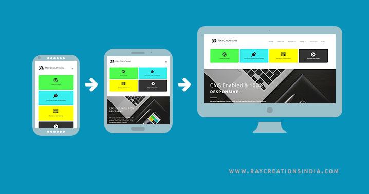
The meaning of Mobile First, is exactly what it says, “Designing for the Mobile Screen First”. First and foremost the designing is done for the smallest screen and then you move outwards to larger screens with more content and features. The benefits make it a clear choice to opt for the mobile-first approach to Responsive Design.
Mobile-First Web Design That Boosts Engagement on Every Screen
Not long ago, websites were designed for desktop first—because that’s where most visitors came from. Today, your audience is far more diverse. People discover, browse, compare, and contact businesses from smartphones, tablets, and smaller screens throughout the day. That means mobile users can’t be treated as an afterthought—because for many businesses, they’re the majority.
A mobile-first approach simply means designing for the smallest screen first, then scaling up. Instead of “fixing” mobile at the end, we start with what matters most: clear messaging, easy navigation, fast loading pages, and tap-friendly layouts. The result is a smoother experience for mobile visitors—and a stronger, more consistent website across every device.
Why Responsive Web Design Is Better?
Responsive web design uses CSS3 media queries and fluid grids to create Responsive websites, with optimal layout and design, for screens with various sizes. So your website layout changes depending on the size of screen being used to view it. There are other parameters that can be used to decide on the layout for a particular device, however, width is one of the primary deciding factors.
Future-Proof Your Website Across Every Device
A responsive website gives you one strong, consistent online presence that works beautifully wherever your customers find you—mobile, tablet, laptop, or desktop. Instead of managing separate versions (and the headaches that come with them), responsive design keeps everything unified, easier to maintain, and better aligned with how people browse today.
With a responsive site, you get:
- One website that adapts to every screen size—no “mobile version” required
- A single URL and consistent content, which helps avoid duplication and keeps SEO cleaner
- Lower maintenance and long-term cost, because updates happen in one place
- A smoother user experience with less zooming, awkward scrolling, or broken layouts
In short, responsive web design delivers the best of both worlds: the usability people expect on mobile and the full experience desktop users need—without the limitations of running separate mobile-specific builds.