
Looking for a new website? Wonderful!
But since you are at it, you must ensure that it is Responsive. I am going to write this article for the benefit of those who are looking to get a new website designed in the very near future and want the best for them.
In this article, I will try to answer the question, why your new website should be Responsive. Of course, this is also going to help those who are still not aware of what Responsive Design is all about.
There has been a lot of hype and buzz around this new technology. It is very much possible that you have already heard of it. Even if you have not, do not despair. I will explain in a very nontechnical language what it is and how it will help you.
What is the definition of Responsive Web Design? Wikipedia defines RWD as the following:
Responsive web design (RWD) is an approach to web design aimed at allowing desktop webpages to be viewed in response to the size of the screen or web browser one is viewing with. In addition, it’s important to understand that Responsive Web Design tasks include offering the same support to a variety of devices for a single website.
So basically it is a solution that enables your website to be viewed on devices of varying dimensions.
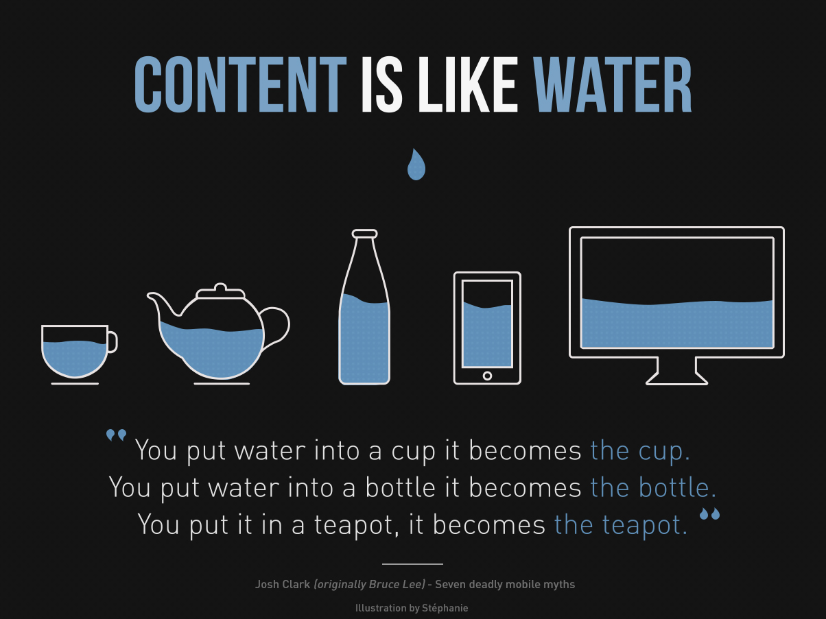
Image credit: Stephanie
It is a way of converting your website to a mobile-friendly layout that changes according to the devices that encapsulate it. Quite similar to the image above.
Related: Responsive Web Design by Ray Creations
PC Sales Declining – What Does It Mean For Your Business
It means people are more on mobiles these days. So why do we design websites? The ultimate motive is to reach out to as many people as possible and deliver the message that we want to get across to them. Right?
It is also true that PC sales have declined over the years instead of going up, as was the trend. More and more people are now buying products that can replace their PC, like tablets, and iPads. And using them to go online and surf the net.
They are also buying devices that smartphones, iPhones, and other devices. And if more and more people are starting to use other devices, shouldn’t your website also be accessible on these devices?
Regular Websites Do Not Work On All Devices
Unfortunately, most websites do not open so beautifully on these devices as it does on a PC. Why? Simply because these sites were designed to work on a PC.

One simple option would be to build a mobile version of your website targeting a particular device. But the number of devices is just too many, and new ones are getting added to the list of existing ones really fast. The devices also differ significantly in terms of screen width, resolution, and orientation.
So the challenge for designing for every screen is huge and is not a practical solution to the problem.
Responsive Web Design To Your Rescue
Ethan Marcotte who has written a book on this new technology. And has a very interesting article explaining the Fundaments of Responsive Web Design. It is an interesting read if you haven’t got the chance to read it already. It talks about “responsive architecture”, responsive design, media queries, etc.
So how does Responsive Web Design solve our problems? Well, with this relatively new technology, you no longer need multiple websites targeting multiple devices. You just need one website that adapts to the device on which it is being viewed.
It does so with the help of fluid images and smart use of CSS media queries by determining the width and resolution of the device. The website changes its layout, resizes images, and adapts quite magically on all devices.
Why Is It Important For My Site To Be Mobile Friendly?
This technology has been around for quite some time now and is being called the future of the web by many. It is a paradigm shift akin to the transition from table-based layouts to CSS, which made a huge impact on the web design industry.
It is estimated that within the next few years, there will be more people online using mobile devices than those using PCs. Therefore, it makes sense to be where your customers are, otherwise, you lose out on business.
If your website is Responsive, your customers can easily access it using any device they like. Your website will adapt to the different screen sizes to always present an optimal view that requires the least amount of panning, scrolling, zooming, etc.
Related: 10 Reasons Why Mobile Optimized Website Helps Grow Your Business
If you are getting a new website designed and it is not Responsive, it is a total waste in my opinion. Whatever technology you use, ensure the website is accessible on mobile devices.
Let’s look at another reason why you should consider a mobile-friendly website. And that is for SEO reasons.
Do Not Get Penalized By Google – Ensure You Have A Mobile Friendly Site
When you reward your users with good user experience, Google rewards you with better search rankings.
We have been creating Responsive websites that work on modern mobile devices just as well as they do on traditional desktops and laptops for a long time now. We have been promoting this concept of a mobile-friendly site because we understand that people no longer are using the traditional ways of surfing the net, they are using all sorts of devices to go online today.
As businesses, we need to adapt to these changing needs and create pages that are easily viewable on mobile devices without zooming, scrolling, panning, etc.
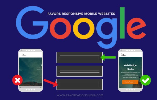
Google Announces More Mobile Friendly Sites In Search Results
Google has taken many steps to motivate people into taking the plunge, and ensure their site is mobile friendly. In an effort to serve more timely and accurate results Google had announced back in April 2015, that all sites that are not mobile-friendly will now be demoted in rankings. There is no point serving up a non-mobile friendly site on a mobile device, is there?
It made changes to its algorithm that impacts search results worldwide in all languages and is considered to have a significant impact on search. It is definitely in the best interest of the web and the users seeking information. As now they will be getting more optimized results on mobiles and other devices.
If you want to test your site for mobile friendliness! Go to this URL: https://search.google.com/search-console/mobile-friendly.
You will see a screen like this:
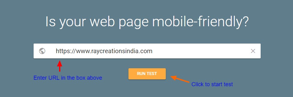
Simply enter your website URL in the search box, as shown in the image above. Then click on “Run Test” to initiate the testing.
It will take a while and then give you the results similar to the image below:
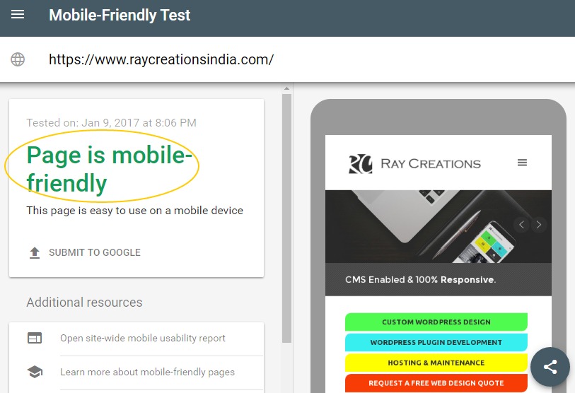
If your results are similar to ours, then you don’t really need to worry about it. It should say “Page is Mobile Friendly”, which means your site displays well on mobiles and presents a good user experience for mobile users.
Conclusion
If you don’t have a mobile-friendly website then you are missing out on potential customers. If you working on your new site, it is the right time to ensure a Responsive mobile-friendly site.
Making a site responsive, it’s not about the devices. To truly connect with consumers today, it’s essential for us to create the most optimal experience for our audience.